Work

Sites I have actually built

One site that works for a real business every day, and eight concept projects. In the concept ones the businesses and reviews are invented and I wrote the copy myself — the code, the design and the measured scores are entirely real. I say so plainly, because passing invented work off as paying clients would be dishonest.

A real business

A site that brings in real work

Before building sites for anyone else, I built one for the photography studio B-Art M Studio. It has been running for years and brings in real enquiries — the one entry here that is not a demonstration.

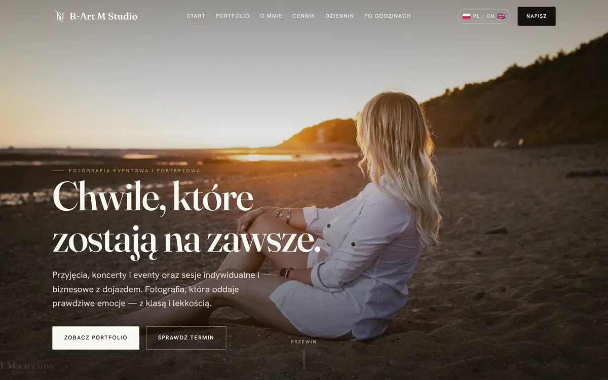
B-Art M Studio homepage — full-bleed sunset photograph with a serif headline

B-Art M Studio — event and portrait photography

  • Warsaw region
  • Photography
  • Bilingual PL/EN
  • Blog
  • Pricing

The whole site is built around photographs, so everything else had to get out of their way: a full-bleed hero, a serif face and a gallery split by category.

Beyond the shop window there is a price list, a journal of guides for clients and a booking form. All of it in two languages, with a switcher and separate addresses for each version.

For the record: B-Art M Studio is a second business of mine, so I was both the client and the builder here. I mention it so nobody counts it as somebody else's commission.
Open the site ↗

Concept projects

Eight trades, eight separate worlds

The easiest way to judge a builder is whether their projects differ by more than colour. These have different typography, different palettes, different section layouts and, in KLAR's case, a different way of moving around the site altogether. The businesses are invented — the point was to show the craft, not to pretend I had the clients.

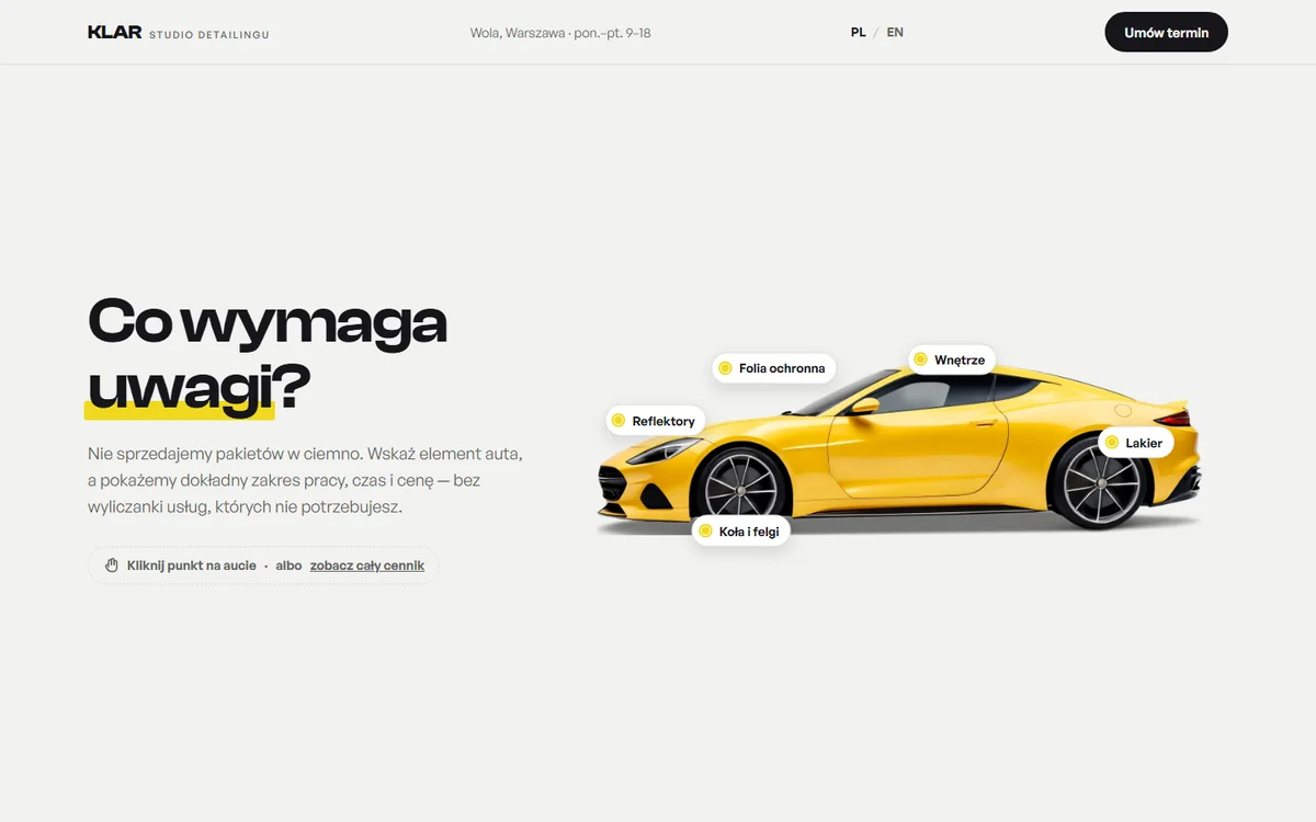
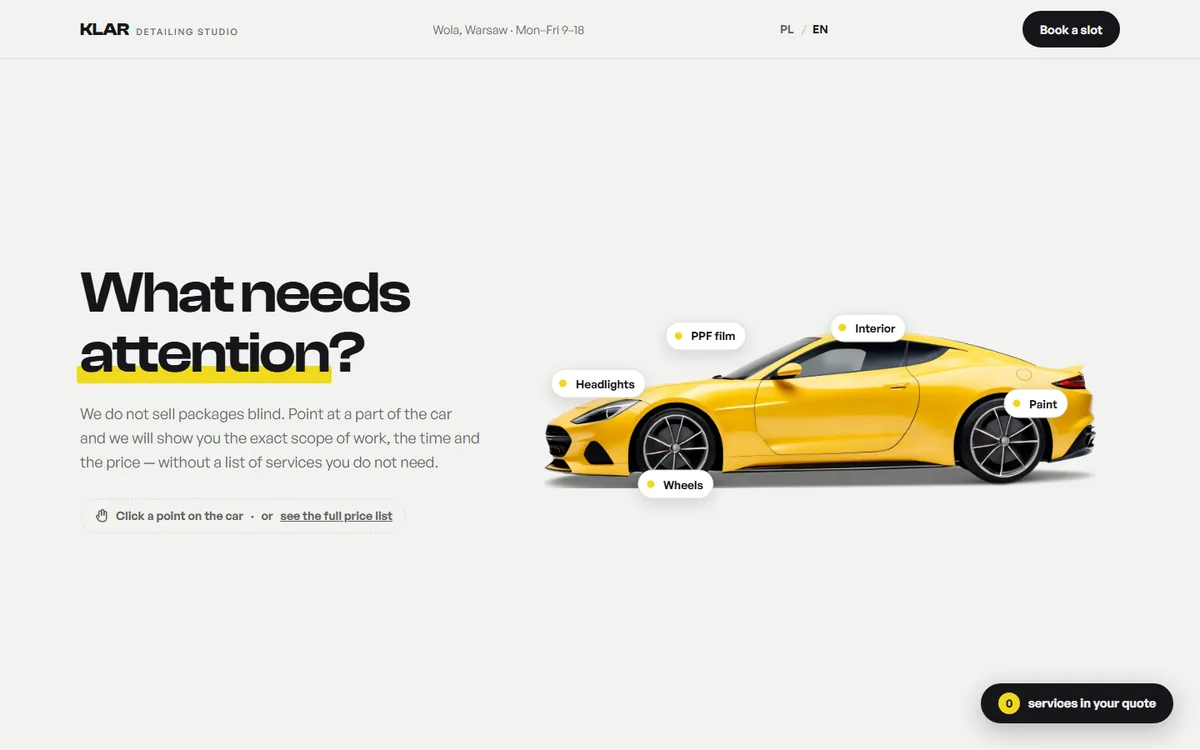
KLAR homepage — light hero with a yellow car and clickable hotspots

KLAR — car detailing studio

  • Warsaw
  • Detailing
  • Quote basket
  • Bilingual PL/EN

Detailing sells on specifics: what exactly gets done and what it costs. So instead of a list of packages, the car itself is the navigation — click the paintwork, the interior, the wheels or the headlights and you get the scope, the time and the price for that one thing.

Chosen services collect in a quote basket at the bottom of the screen and travel with the enquiry form. The customer never has to describe what they want in words — they just click it.

This is the kind of custom interactive element the Signature tier is built around. PageSpeed: a full 100 points, in both languages.

Open the site ↗

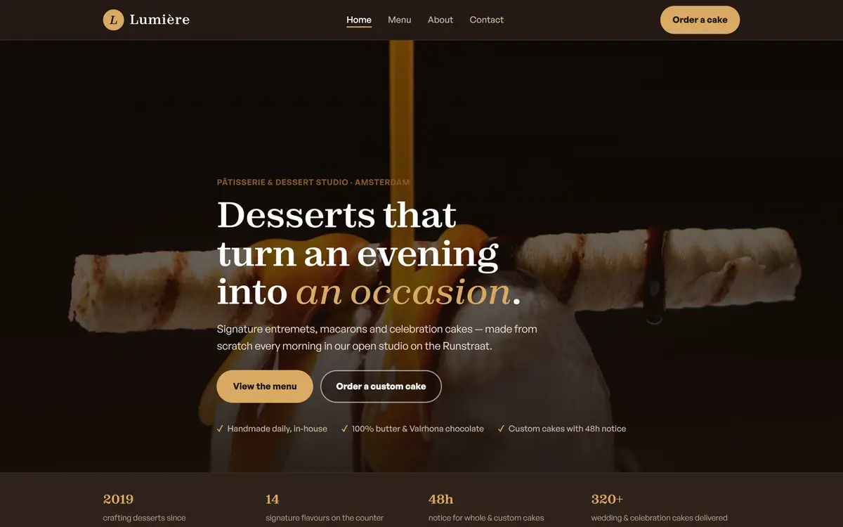
Lumière homepage — dark hero with a dessert photograph and a serif headline

Lumière — dessert studio

  • Amsterdam
  • Hospitality
  • 4 pages
  • Order form

A patisserie with an extensive menu and celebration cake orders. The mood of a Parisian workshop, built from a serif typeface, chocolate browns and a gold accent.

Sections: full-screen photographic hero, statistics bar, category cards, gallery, reviews, FAQ and an order form with a collection date.

Mobile PageSpeed: 99–100 points for performance, accessibility, best practices and SEO.

Open the site ↗

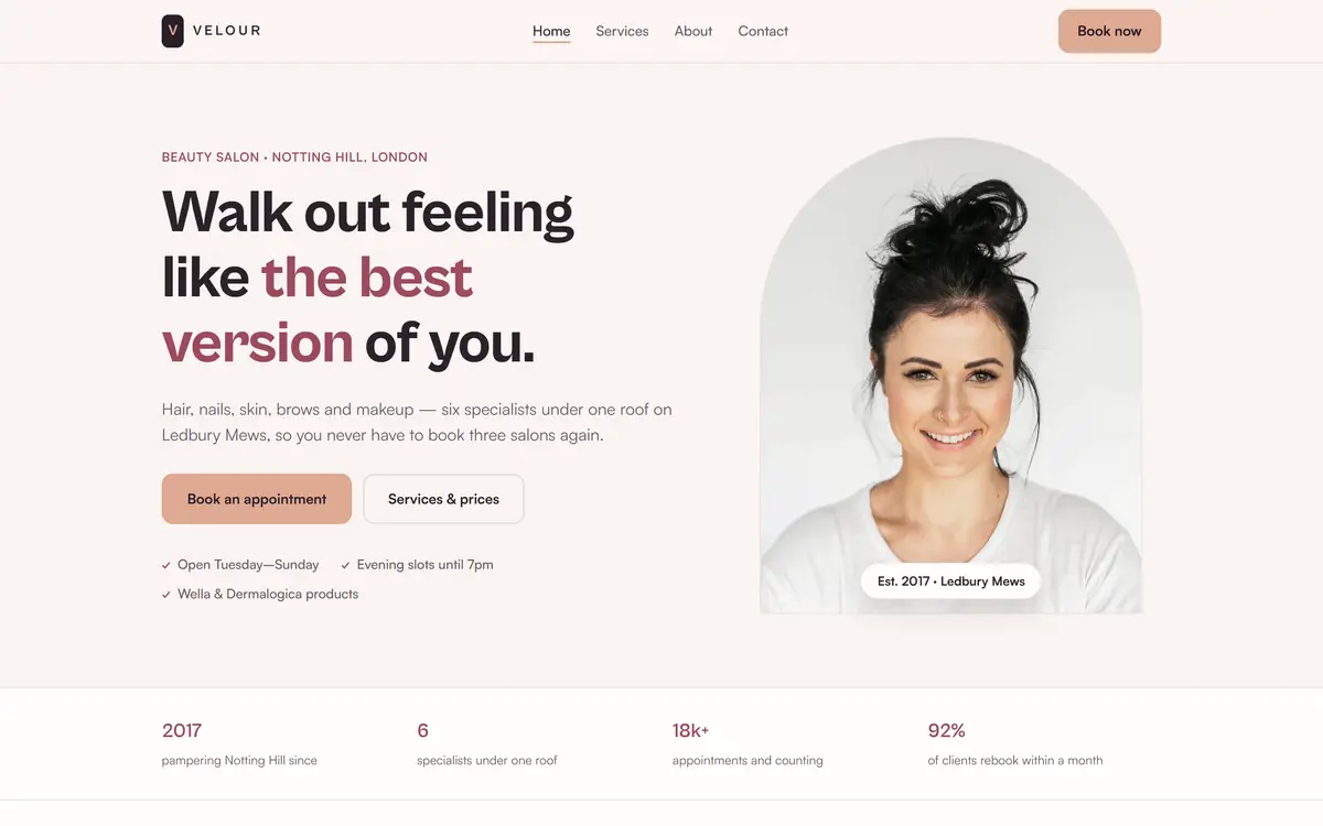
Velour homepage — light hero with an arch-shaped portrait

Velour — beauty salon

  • London
  • Beauty
  • 4 pages
  • Full price list

A hair and beauty salon with a categorised price list, team profiles and appointment booking. A light, warm palette and a soft grotesque instead of serifs.

I deliberately built this one as the inverse of Lumière: a light hero with an arch-shaped portrait, services as rows rather than cards, a mosaic gallery and a review carousel.

PageSpeed: a full 100 points across all four pages.

Open the site ↗

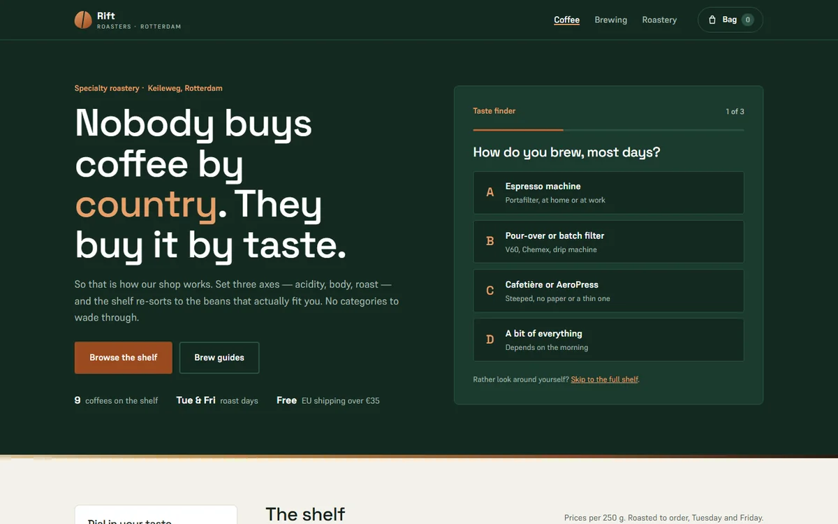
Rift homepage — dark hero about buying coffee by taste, with a taste finder on the right

Rift Coffee Roasters — coffee roastery

  • Rotterdam
  • Coffee
  • Shop
  • English

Coffee shops file their beans by country, even though nobody buys a coffee because it comes from Colombia. Rift sells by taste: three sliders — acidity, body and roast — and the shelf re-sorts as you move them, showing how many coffees still match.

Every coffee is scored on those same three axes, and a separate section explains what the scores actually mean. For anyone who does not know where to start, there is a taste finder in three questions.

Concept demo — invented company, real code.

Open the site ↗

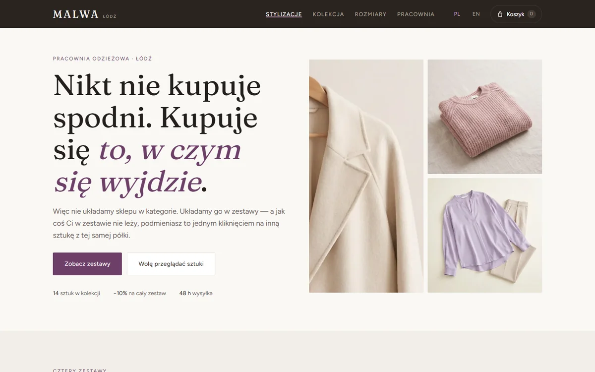
MALWA homepage — cream hero about buying whole outfits, with photographs of clothes

MALWA — clothing studio

  • Łódź
  • Clothing
  • Shop
  • Bilingual PL/EN

Clothing shops file their stock into categories: trousers, blouses, coats. Except nobody buys trousers — you buy the thing you will walk out in. Malwa sells outfits: four complete sets, and any single piece swaps for another from the same shelf in one click. The total and the discount recalculate straight away.

Sizing is solved without a chart. You enter three measurements once, they stay in your own browser and are never sent anywhere, and each piece tells you whether it runs loose or narrow on you.

Concept demo, bilingual — invented brand, real code.

Open the site ↗

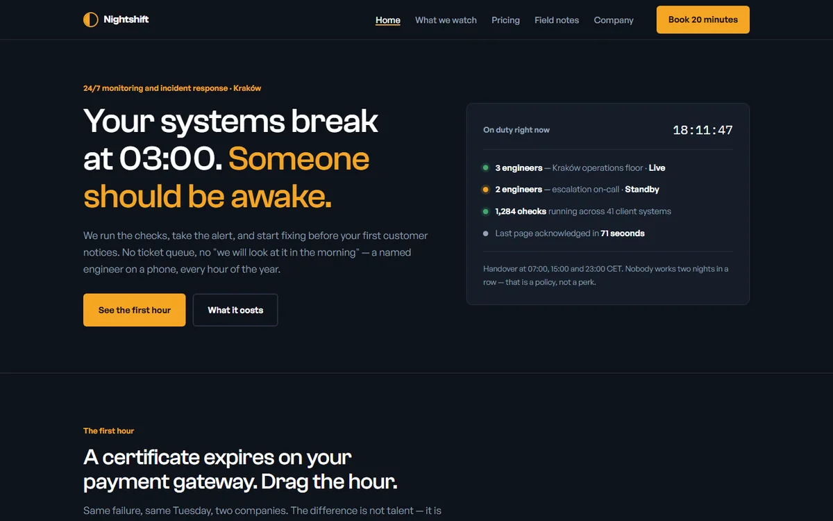
Nightshift homepage — dark hero about systems breaking at 3am, with an on-duty panel

Nightshift — monitoring and incident response

  • Kraków
  • B2B
  • Timeline
  • English

Monitoring companies sell dashboards. Nightshift sells the difference: a slider walks the timeline minute by minute from the moment a certificate expires, and shows side by side what happens with nobody watching and what happens with an engineer on duty.

Next to it sits a field for your revenue per hour, so the outage turns into money while you read. Prices are published outright, in three sizes, with no „contact us for a quote”.

Concept demo — invented company, figures written for the demo.

Open the site ↗

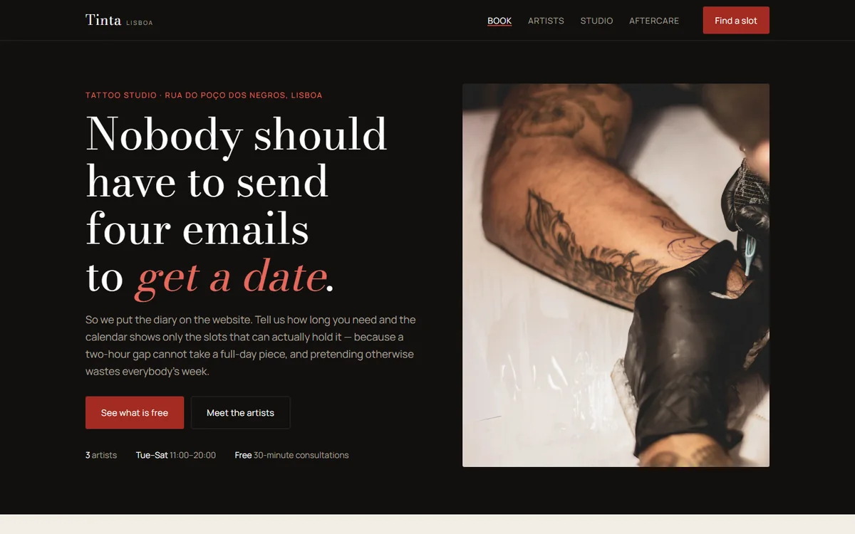
Estúdio Tinta homepage — dark hero with a photograph of a tattooed forearm and a booking button

Estúdio Tinta — tattoo studio

  • Lisbon
  • Tattoo
  • Booking
  • English

Booking a tattoo usually takes four emails back and forth. Tinta starts by asking how long you need — a consultation, a small piece, half a day or a full one — and the calendar then shows only the slots that can genuinely hold that work.

Three artists have their own rates, working days and waiting times, so choosing a person changes which dates open up. The deposit and the cancellation rules are written down before anyone sends a form.

Concept demo — invented studio, real code.

Open the site ↗

H&A Renovations homepage — dark hero with a before and after slider

H&A Renovations — building firm

  • Netherlands
  • Construction
  • Calculator
  • WhatsApp

A renovation crew — a trade where the customer wants to see the result and get a price fast. Hence the interactive before-and-after slider, the rough cost calculator and WhatsApp contact.

A dark, high-contrast palette with an orange accent and a heavy condensed typeface — the visual language this trade already expects.

Open the site ↗

Want a site built to this standard?

Get in touch